LFC home shirt – 2017/2018
Normally, we’re not too concerned about a new kit being unveiled. As long as it’s red, we’re happy. Move on. Nothing to see here. This year, it feels a little different. It’s the 125th Anniversary of LFC’s foundation, and there were plenty of rumours about how the new kit would incorporate that (mermen?). We knew it would be a bit special, and we’re not disappointed at all. We’ve got our hands on one of the shirts, and here’s our first impression.
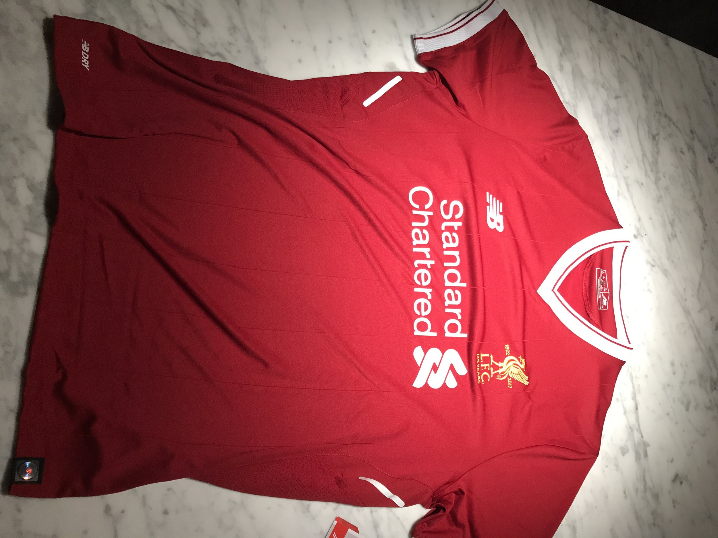
It’s red!
First of all, it’s red…that’s a good start, I think we can all agree. The white v-collar and sleeve trim hark back to the early 80s shirts, which is no bad thing. The shirt wouldn’t look out of place with Crown Paints plastered across the front.
The new 125 year badge is simple and elegant. Nothing too showy, around a simple golden Liverbird. The other detail you’ll see up close is the pinstripes, which again hark back to the classic strips work by Hansen and Dalglish.
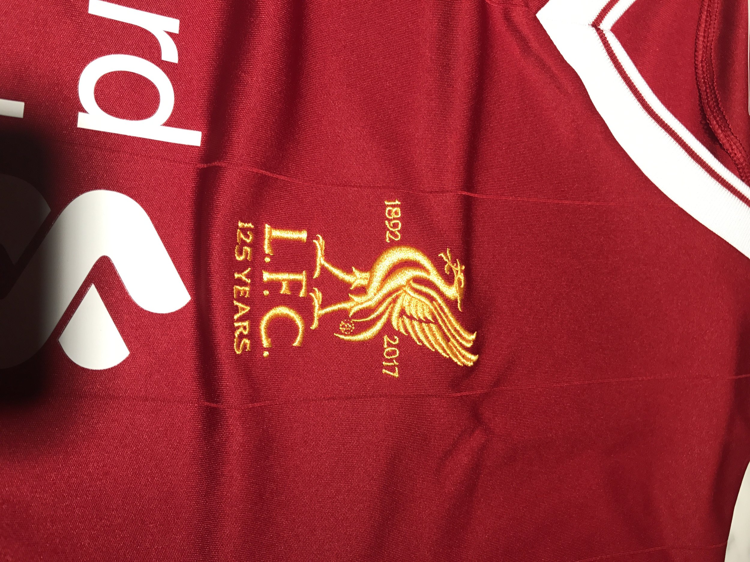
Badge and pinstripe
Finally, and most importantly, the back of the shirt is once again emblazoned with the number ’96’ and the memorial flames. #JFT96

#JFT96
As we said at the beginning, we’re not normally arsed about a new kit launch, but this one felt a bit different. A bit special, and New Balance haven’t disappointed at all. It’s the best home kit in years, and we can’t wait to see it worn on the terraces, and on the pitch, next season.